Sound Drinks

Regaining a category pioneer’s edge in a saturated market

Rows of Sound sparkling water cans arranged diagonally, featuring colorful, wavy designs in blue, red, orange, and green on a white background.
Sound Drinks

Industry

  • Consumer Packaged Goods

What We Did

  • Brand Strategy
  • Visual Identity
  • Packaging
  • Go-To-Market Strategy
Rows of Sound sparkling water cans arranged diagonally, featuring colorful, wavy designs in blue, red, orange, and green on a white background.

How do you reclaim space on a crowded shelf?

Sound was a pioneer when they launched their organic sparkling tea drinks in 2015. Five years on, the brand was seen as a niche player in the innovation-hungry category of sparkling beverages.

With a top-notch product, a mission to bring wellness to the wider world, and a growing pool of customers participating in sparkling, Sound’s founders wanted to reinvent the brand to live up to the promise of the product.

Redscout partnered with Sound to create a brand identity that would help them become the beverage of choice for a new wave of customers.

Side-by-side comparison of Sound sparkling water can designs. The previous design on the left features a blue and white color scheme with bold text. The new design on the right has a softer cream background with curved, multicolored wave patterns and a modernized logo.
An assortment of Sound sparkling water cans and glass bottles, arranged in a row against a beige background. Each beverage features a colorful, wavy design on the label, with different flavors such as blood orange, grapefruit, tangerine, chamomile, and blueberry.
Two Sound sparkling water cans floating against a light green background. The cans feature a modern, wavy design in orange, green, and peach colors, with the label highlighting the Tangerine Lemongrass Green Tea flavor and organic unsweetened ingredients.
Four cans of Sound sparkling water are artistically arranged on a soft linen cloth, surrounded by fresh oranges, blood orange slices, and small white flowers.
A person sitting outdoors in a red and white lawn chair, wearing jeans and a white t-shirt with yellow stripes on the sleeve, opening a can of Sound sparkling water.
Young woman with curly hair drinks from a can of Sound sparkling water under a clear blue sky.
A person reaches into a red cooler filled with ice to grab a can of Sound sparkling water, with another can resting inside. The scene is set outdoors on a picnic blanket.
Cans of Sound sparkling water are arranged on an orange wooden table, surrounded by whole and halved blood oranges, along with glasses of citrus-infused drinks.

We came into the project with high expectations but were truly blown away by the professionalism, structure and rigorous process employed by the team at Redscout. Their design talent and holistic approach led to a new visual identity and package design that feels approachable and familiar, while also completely fresh and unexpected.

Smiling man in a muted green shirt poses in front of a rustic brick wall.

Tommy Kelly

Co-founder & Chief Executive Officer

Four Sound sparkling tea bottles displayed in a row against a light green background. Each bottle has a colorful, wavy label featuring different flavors: Sparkling Green Tea with Mint and Grapefruit, Sparkling Yerba Mate with Citrus and Hibiscus, Sparkling Chamomile with Vanilla and Elderflower, and Sparkling Rose Tea with Lime and Cardamom.
A bottle of Sound Sparkling Yerba Mate with a colorful wavy label sits on a light stone surface next to a glass filled with the bubbly golden beverage over ice.
Bottles of Sound sparkling tea are chilled in a bed of ice, with condensation forming on the glass, showcasing their refreshing appeal.

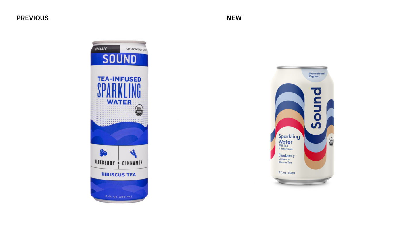
We designed an identity system that brings flow and balance to everything it touches.

‘Sound’ hints not just at a harmonic relationship between body, mind and motion, but the care-free spirit that comes from knowing what you’re consuming is delicious, organic and unsweetened. We used the name and origin story as the foundation to create:

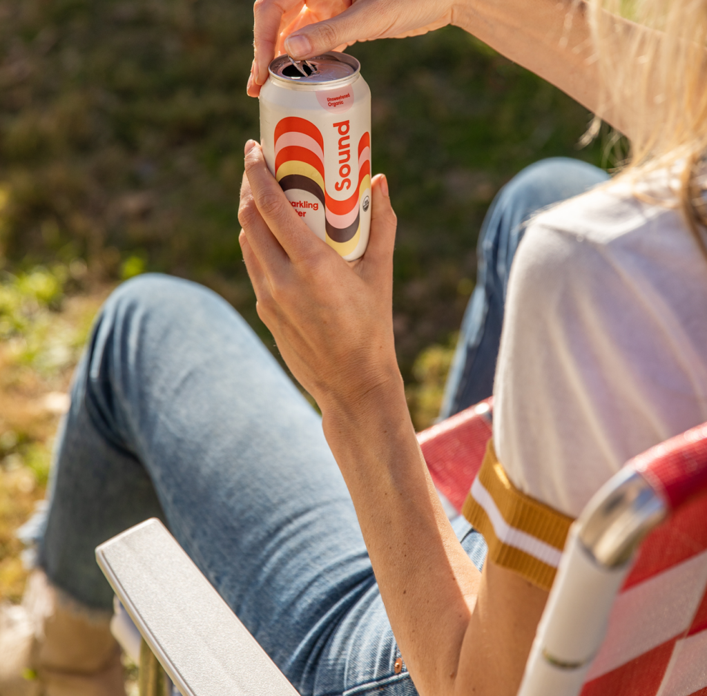
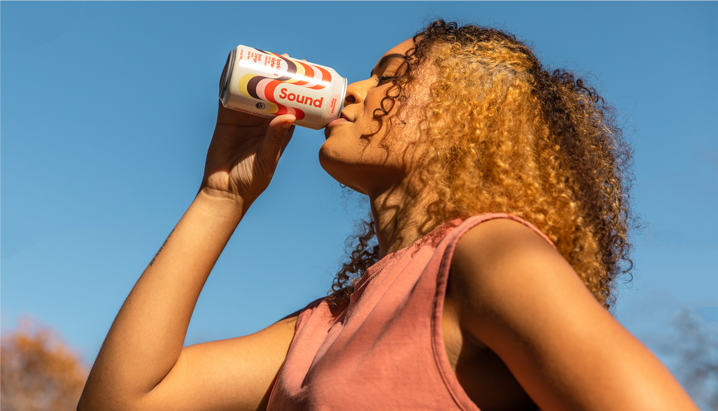
A sparkling new identity.
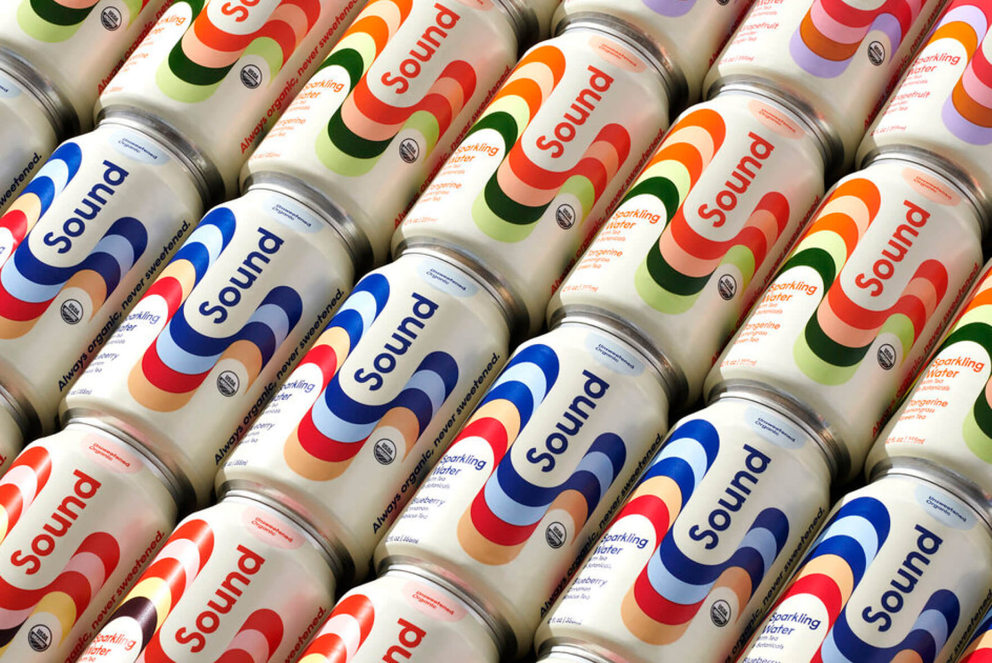
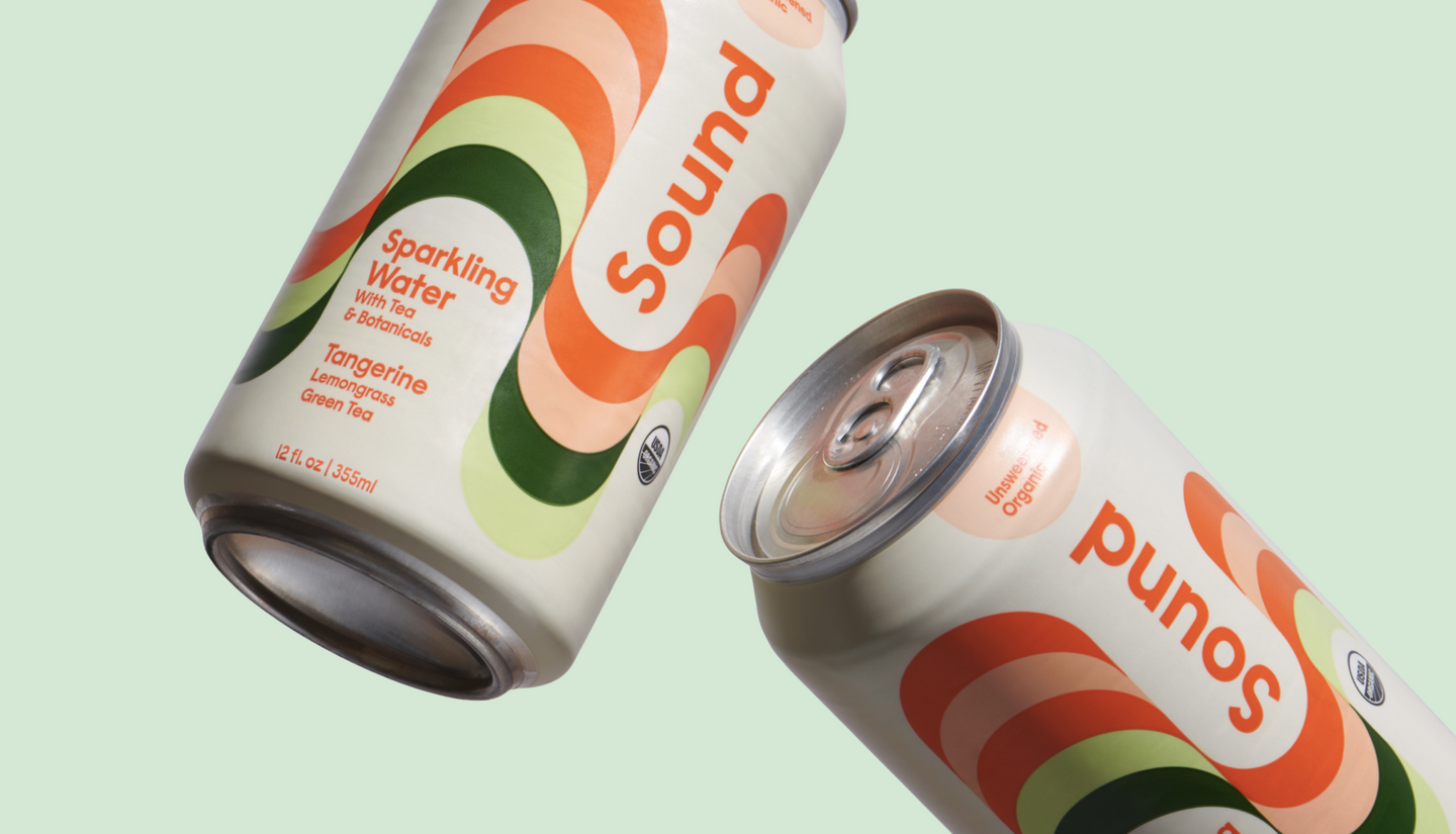
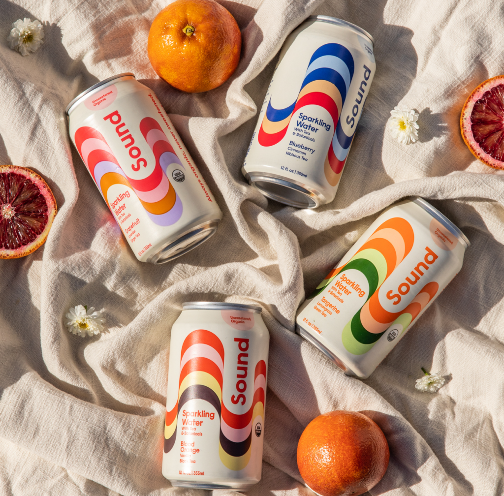
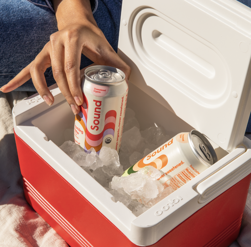
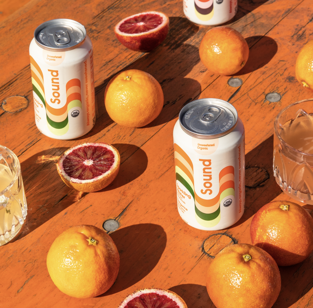
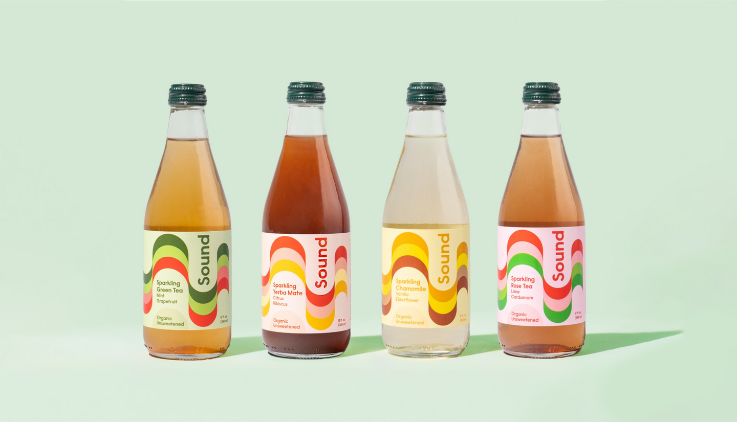
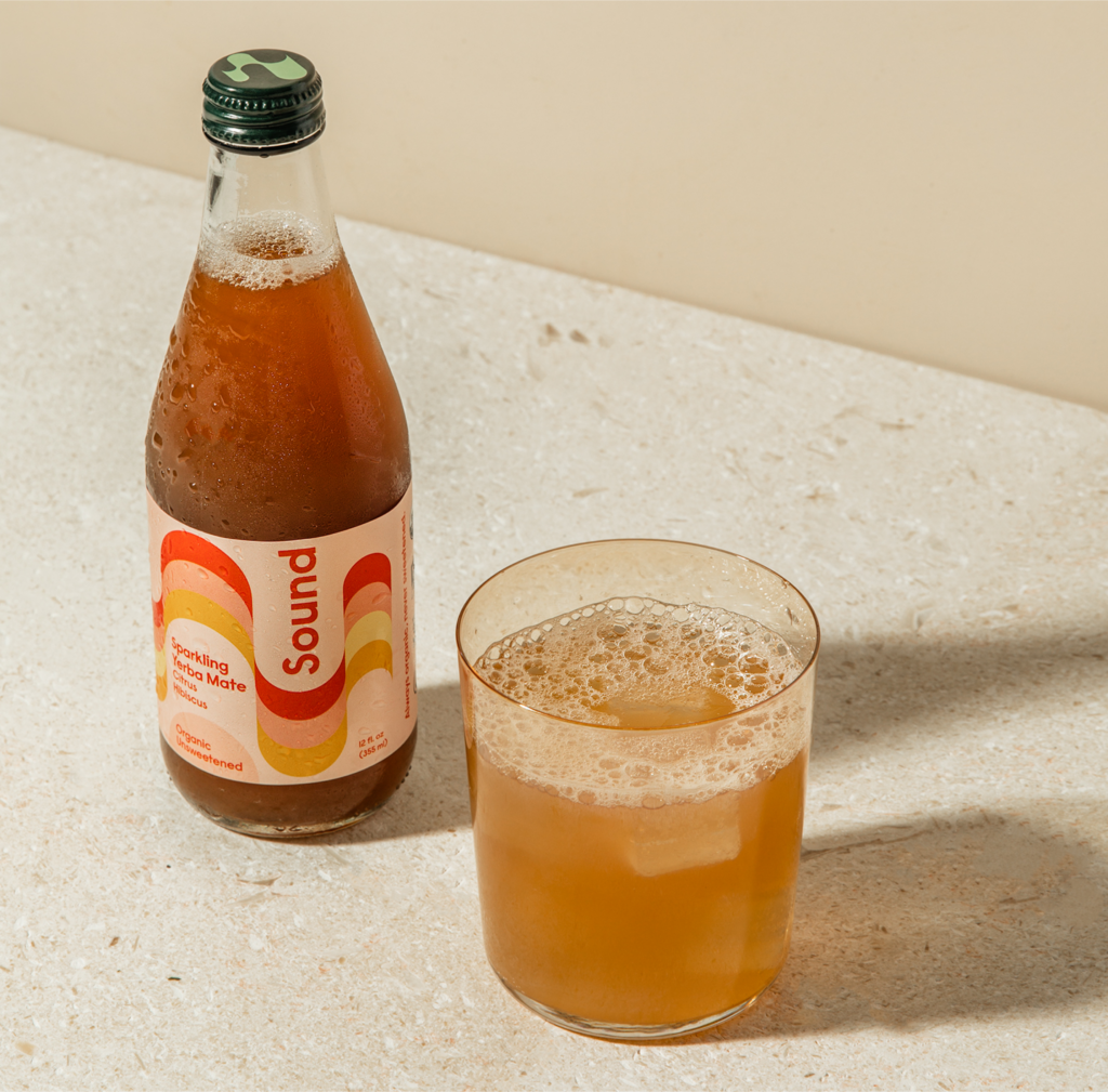
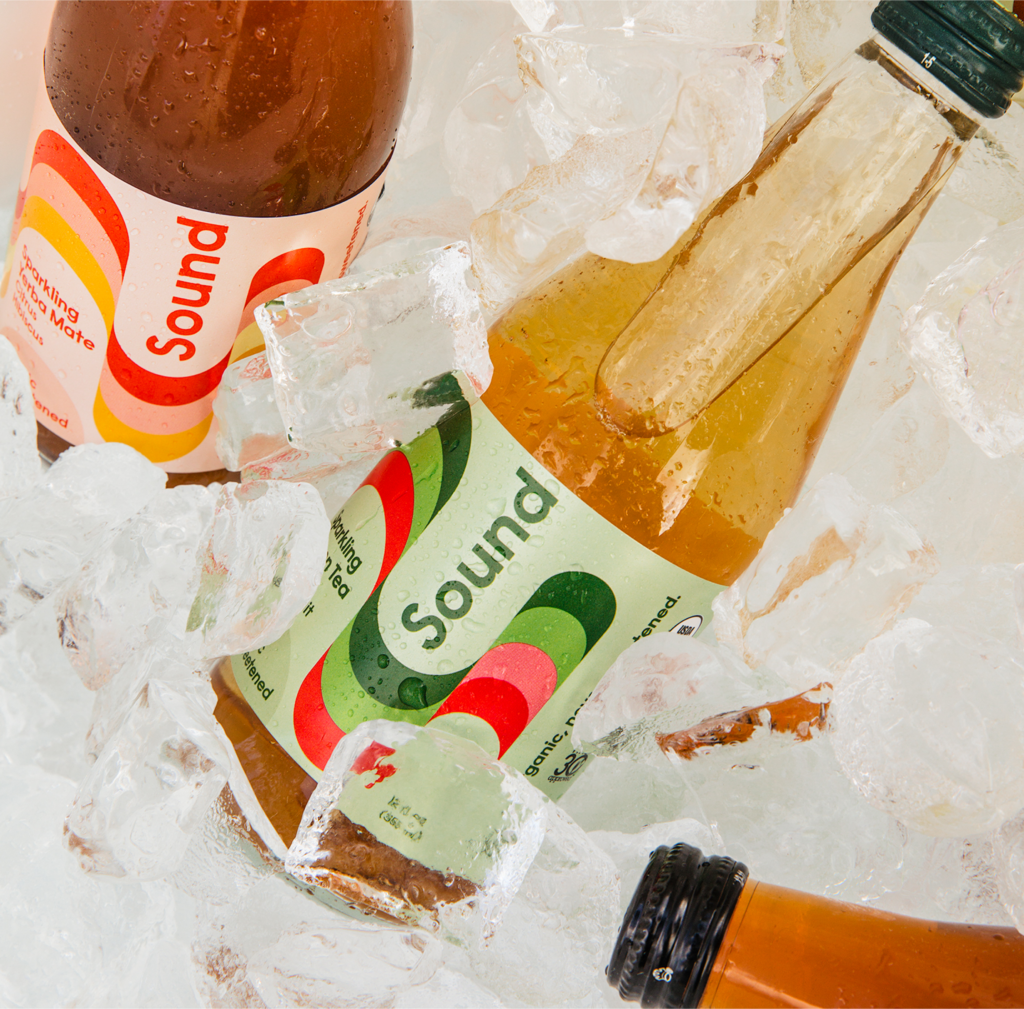
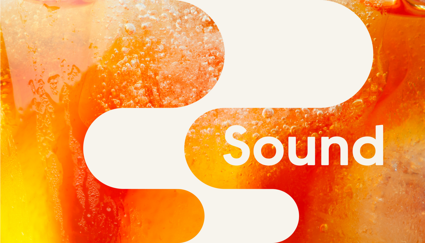
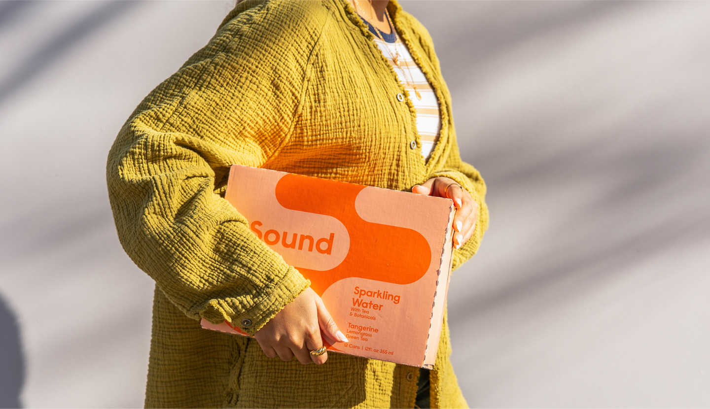
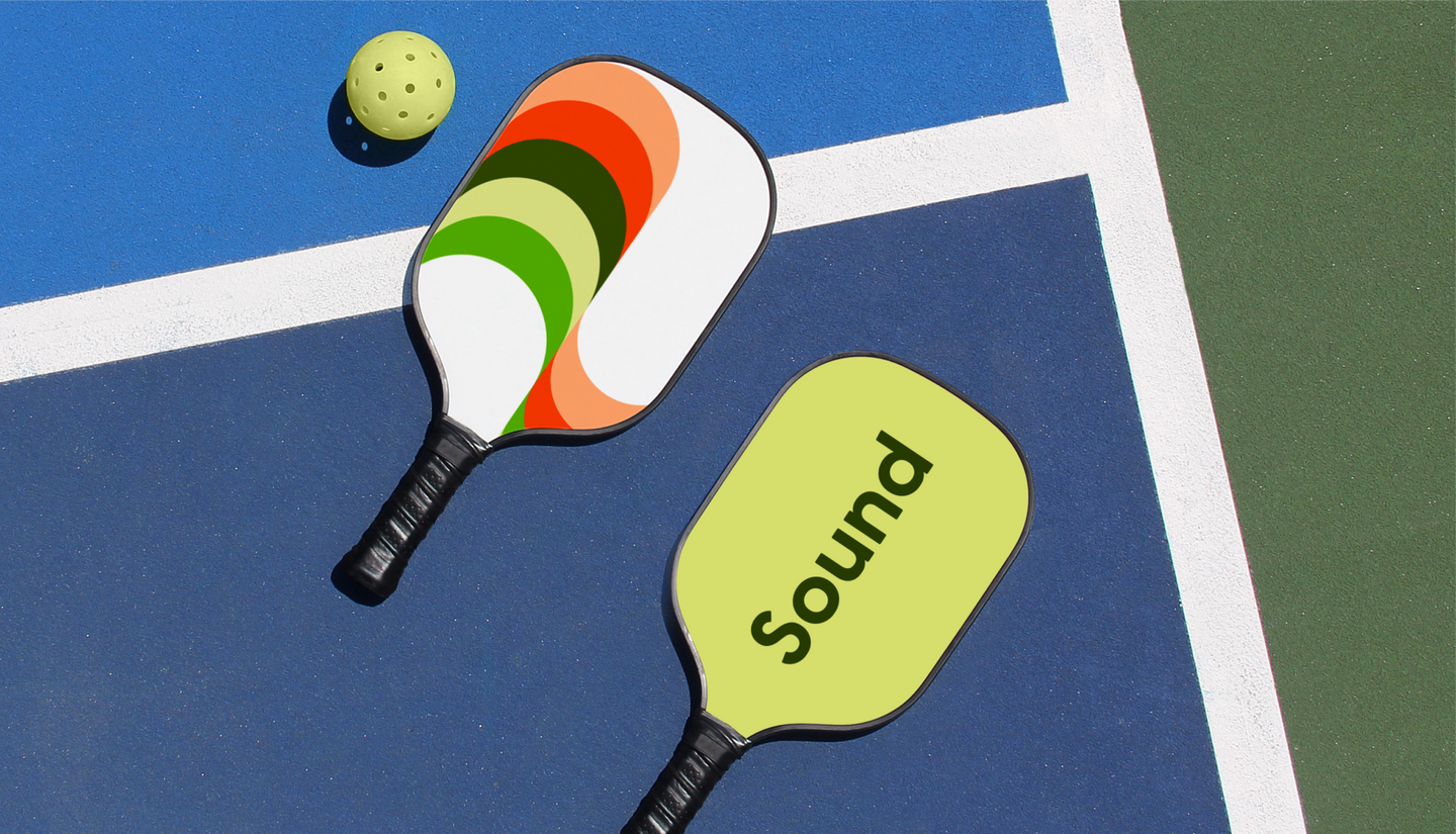
With tessellating waves of color, the new identity brings flow, balance and vibrancy to every surface. A central graphic device, an S shaped motif, serves as a mark, super graphic, and pattern-generating element that introduces movement and cues flavor.

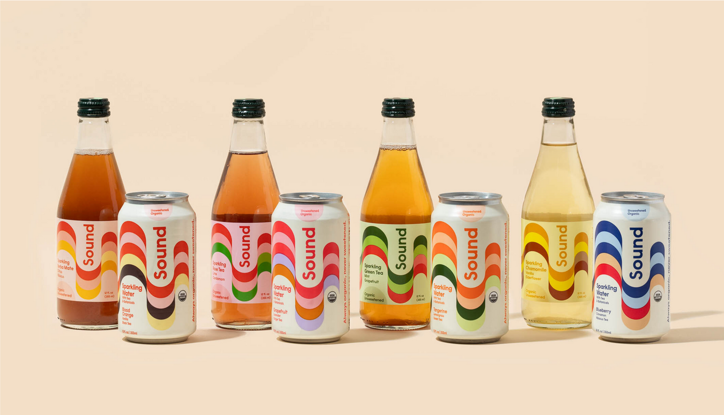
Colorful flavor cues that pop.
Each SKU bursts with a unique combination of colors which correspond to the unusual ingredients within each can. Together, the patterns create a cohesive and dynamic brand statement, turning heads and sparking interest on shelf.

Abstract design featuring bubbly orange liquid with the word 'Sound' in bold white text overlaid on a stylized beige shape.
A person wearing a textured yellow cardigan holds a box of Sound sparkling water in tangerine flavor against a neutral background with soft shadows.

Impact

A brand that’s grown its market penetration.

With its bright new look and pack, Sound grew from 5 to 500 accounts on the West Coast. The brand earned its way into Whole Foods stores nationwide and was featured on the Whole Foods Market list of Food & Beverage Trends for 2022. In 2021, Sound saw 3x growth in same-store sales velocity.

Two pickleball paddles with Sound branding and a yellow ball rest on a blue and green court near a white boundary line.

Additional Collaborators

Copywriter: Fern Diaz
Photography: Wonderkind Co.
Photography: Mari Juliano